
EverBoots
Brand stewardship & site UX/UI · 2025–2026
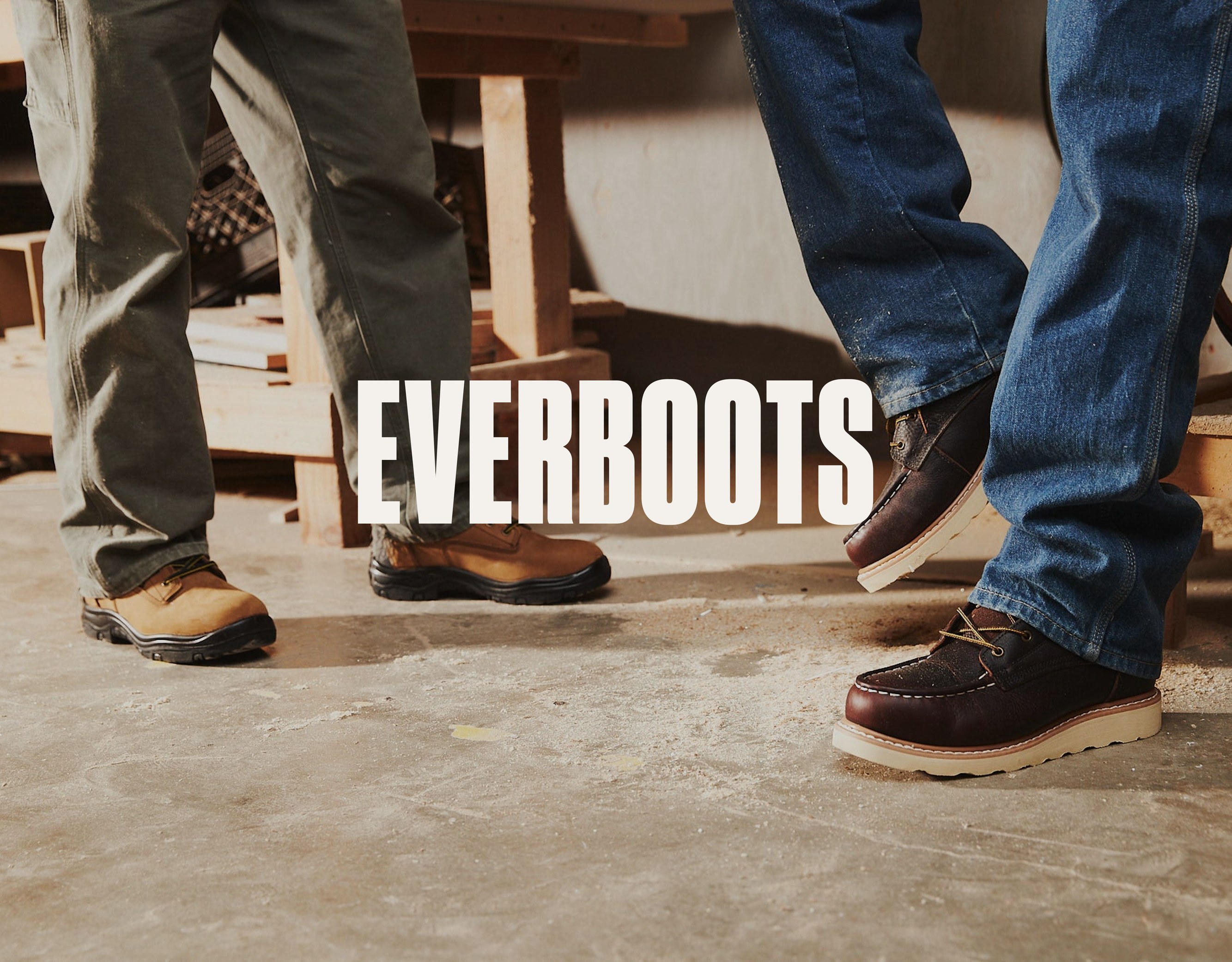 EverBoots — work boots, priced fair, with a site rebuilt around the people who wear them.
Creative Direction · Brand Guide & Stewardship · Website UX/UI Design · Shopify Development · Spanish-Language Site Context
EverBoots makes fairly priced work boots for people who spend the whole shift on their feet, and sells them on Amazon and its own Shopify store. The brand had a strong identity from its 2022 brand guide, but the site wasn’t using it: a brand audit scored the store 53 out of 100 against its own guide. The licensed brand fonts were barely used, headlines appeared in two different typefaces, and colors drifted off-palette. A good share of its customers are Hispanic, and many are more at home shopping in Spanish.
Make the existing identity usable by everyone producing work for the brand. Rework the site so customers can find the right boot quickly. Make the site as easy to shop in Spanish as it is in English.
everboots.com

The work split into eight streams, each aimed at making the brand easier to use — for the team producing it and the customers shopping it.
- Audit first — Shopify, brand, and full-site audits that surfaced duplicate apps, listings, and pages, off-brand type and color, slow mobile pages, and a top seller whose description was trapped inside images
- A living web brand guide built from the brand’s 2022 and 2025 guides — palette, type, logo rules, voice, content pillars, and a standard six-shot product list
- One brand system across the whole storefront — the brand’s own headline and body fonts on every page (cart and review apps included), one type scale, one palette, consistent spacing, and no single-word lines
- One shared product template for all 21 products — sections fill from each product’s own data and hide themselves when a product has nothing to show, plus a rebuilt buy box, gallery, and feature icons, and a branded size chart
- Clean product data — options always in Color, Size, Width order, standardized widths (Regular, Wide, Extra Wide), feature, closure, and material data that powers the filters, and each colorway split into its own listing, linked by color chips
- Collections and navigation organized by the job — Construction, Waterproof, and Lifestyle Boots, plus Men’s Boots, New Arrivals, and Clothing & Accessories — and four new styles launched, including the women’s Sierra
- The brand story, told — a new homepage and an About page built around the founder’s promise
- A Spanish-language version of the site, treated as an accessibility requirement — easy to find and just as easy to shop
everboots.com/collections/all
everboots.com/products/tank

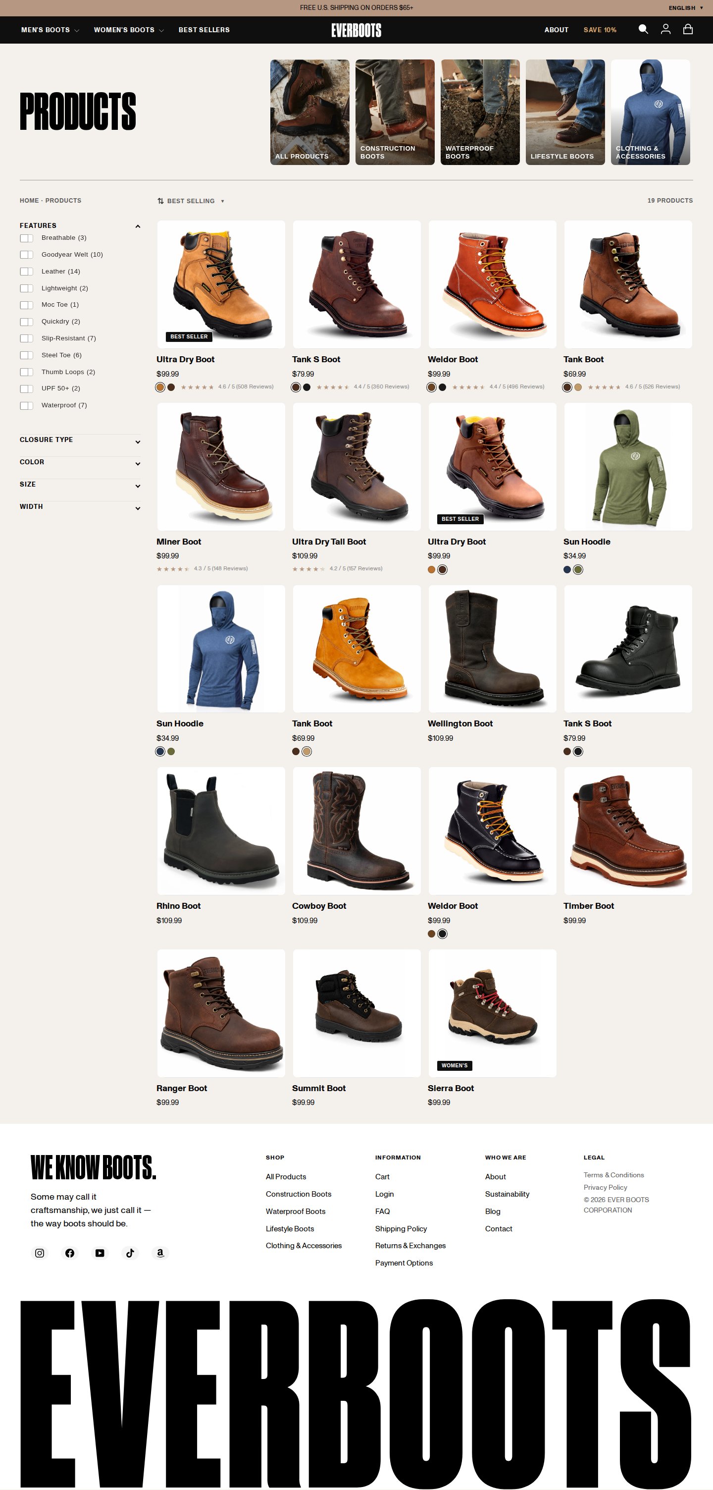
Left: the collection page, organized by the job, with category tiles and feature filters. Right: the Tank Boot product page, leading with construction, fit, and the 90-day Tough As Ever guarantee.
everboots.com/pages/about

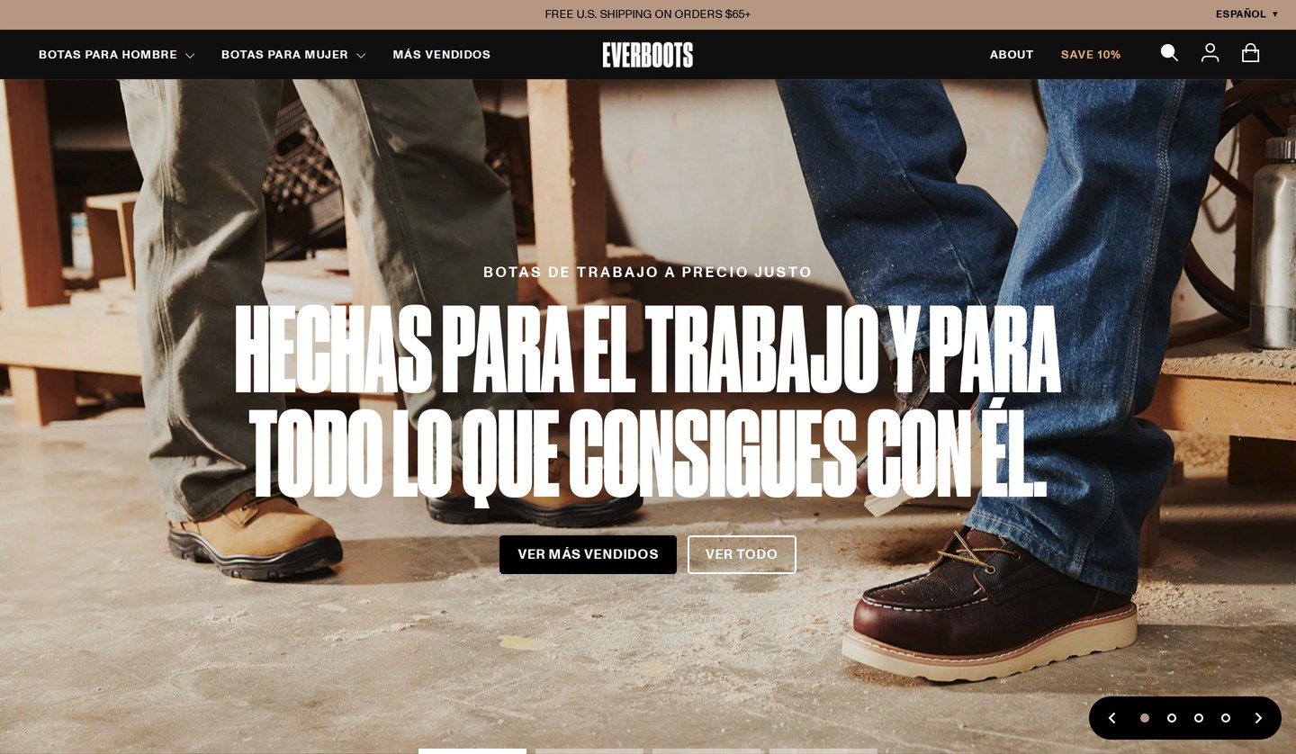
A good share of EverBoots customers are Hispanic, and many are more at home reading Spanish than English. So we treated the Spanish site as an accessibility requirement, not an add-on: a language switcher on every page, on desktop and phone, the main shopping path — navigation, collections, and product pages — in Spanish, and product names kept in English so customers can match what they see on Amazon. Next comes a native-speaker review of the pages where a mistake costs the customer most: sizing, the guarantee, and returns.
everboots.com/es
Over five months, from the first audits in May to the October relaunch, the storefront went from a store that used the brand loosely to one system: the brand’s own type and palette on every page, one product template across the catalog, collections organized by the job, and a site customers can shop in English or Spanish. Since the rebuild, monthly orders are up about seven times, and shoppers arriving from search, who land on a product page and decide there, now buy at roughly three times the summer rate.
July → October 2026 (Shopify DTC):
~7×
MONTHLY ORDERS, JULY → SEPTEMBER
~5×
ORDERS FROM SEARCH
~3×
SEARCH-SHOPPER CONVERSION VS. SUMMER
Source: Directional figures from Shopify Analytics. Paid social and a free-shipping change launched in the same window, so search shoppers are the clearest read on the site itself.
Brand guide, audits, and site UX/UI: led by Kathrine Gilmer of Aster House, independently in 2025 and as contract creative director for 88 Venture Studio in 2026. EverBoots identity, wordmark, and typefaces from the brand’s 2022 brand guide. Images courtesy of EverBoots.
← View all work Work with us →
Keep Exploring

