
pretti.cool — Brand Refresh
Brand & packaging refresh · 2023
Brand Refresh · Wordmark & Marks · Color System · Packaging Design · Merch Program · Product-Line Direction Context
pretti.cool is the homegoods brand Kathrine co-founded in 2017 and has been a managing partner of since. By 2023 the brand had outgrown its original identity.
Refresh the marks, color, and packaging into one cohesive system that is better-aligned with the current brand voice — and source/produce a complementary line of merchandized apparel and accessories. Approach
A full identity refresh, designed in-house and applied across every physical surface the customer touches.
- Refreshed the wordmark and brand marks
- Built an updated color system
- Redesigned packaging across the line — designed by Kathrine
- Developed the merch program — sourced blanks, commissioned and applied graphic assets
- Contributed product direction on new incense and candle scent additions to the line
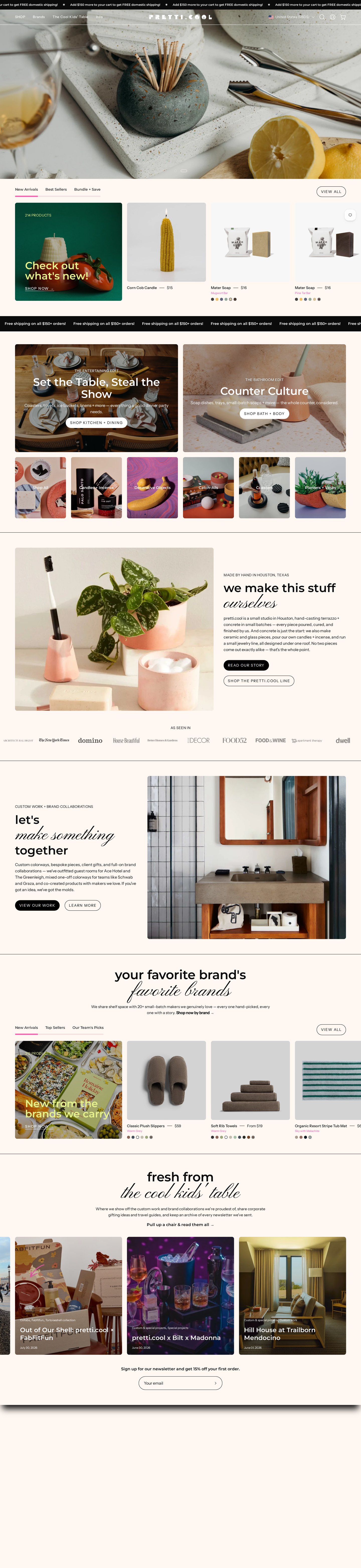
The refreshed identity in the wild — applied across the live pretti.cool storefront, where the brand reaches customers every day.
pretti.cool
An updated wordmark suite paired with a 7-color core palette — Bright Pink and Muted Lime as primary accents, Pale Cream as the dominant background. The visual foundation the rest of the refresh is built on.
Core Palette
Bright Pink
#F960B1
Primary accent
Muted Lime
#E5F18B
Secondary accent
Light Mauve
#E6CACA
Soft button accent
Pale Cream
#FFF7F2
Section background
Light Grey
#F7F7F7
Cool-neutral background
White
#FFFFFF
Universal background
Near Black
#0B0B0B
Primary buttons & type
Body Grey
#3E3E3E
Body type
Redesigned across the line — packaging that carries the refreshed identity onto every product, from product labels to displays.
Sourced blanks, commissioned and applied graphic assets — extended the brand into wearable and tactile surfaces, worn by adults and kids alike.
A cohesive 2023 identity — new marks, color, packaging, merch, and scents — shipped across the full line. The refresh sharpened the visual system that has carried pretti.cool through 100+ editorial features since 2018, including Architectural Digest, Forbes, NYT Wirecutter, Oprah Daily, The Strategist (NY Mag), Domino, HGTV, House Beautiful, Elle Decor, Better Homes & Gardens, Good Housekeeping, GQ, The Cut, Cup of Jo, Sight Unseen, and Dwell.
Kathrine was personally interviewed by Forbes (2024) as a design pro alongside co-founder Jeff Gilmer in "How To Create A Tablescape, According To Design Pros."
Full press list: pretti.cool/pages/press
2023 brand refresh and packaging: designed and directed by Kathrine Gilmer of Aster House, co-founder and creative director of pretti.cool. Lead product design: Mike Garman.
← View all work Work with us →
Keep Exploring

